We finish off this week with one of our latest projects, designed and built by us: the ground floor of the insurer MetLife, in Madrid. The challenge involved reorganising the reception, customer service and waiting room areas, which were not in a layout suitable for the client. Furthermore, they wanted to give a new twist to the company´s aesthetics, moving towards simple colour combinations, with clear tones and a renewed image. This is how we set out our idea.

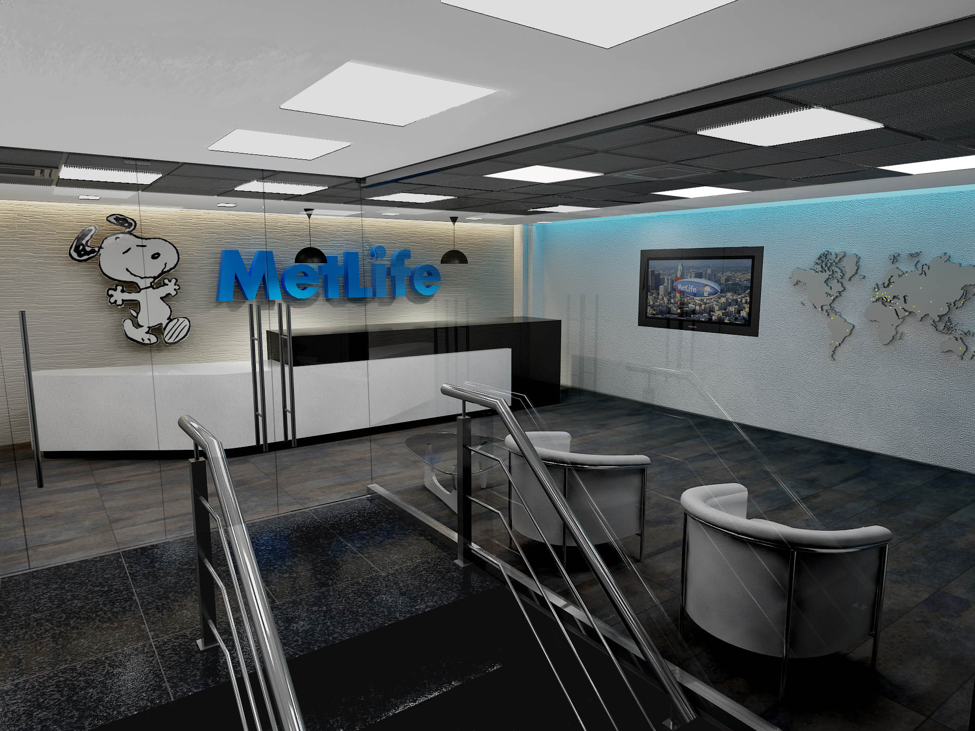
Our basic idea was to organize the flow of people, separating the transit of employees from that of visitors in the reception area. The rest of the area we imagined as being always open plan, so that the entire space could be perceived from any given point. This we achieved using a large glass box, in order to insulate the waiting area, from the entrance.

With regards to the interior design, we opted for creating an essentially white space, breaking from the black of the floor and reception counter. The wood (especially treated for public areas) gives this area the warmth and personality that the space requires, given its size and cold colour range, which includes many steel elements.

The furnishings include an iconic component (the Noguchi table) and several comfortable chairs which follow the colour range white+steel. Furthermore, a huge reception desk, designed by us, stands out as the key element of the waiting area. We constructed something very minimalist, in black and white, that gives a clean appearance whilst proving practical as a workplace for the receptionist.


The design of the walls included different signage elements that represent the company and its ideals, ranging from methacrylate logos to a map with LED lights pointing out all of the offices in all of the cities across the world.

As you can see, the final image is not far off our original proposal. What do you think?
